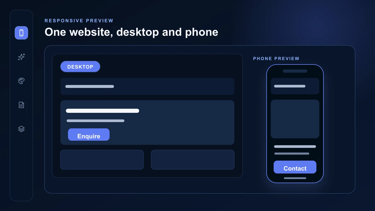
The AVSBL builder keeps editing controls around a live representation of the website. The preview and published renderer use the same selected layout data so the live result stays close to what was built.
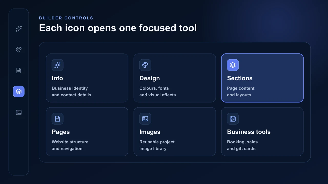
Move between the main panels
Info controls the business identity and primary website information. Design controls the palette, typography and visual effects. Sections adds and configures page content. Pages changes the active page and website structure. More contains additional website functions and settings.
On desktop, the main tools appear beside the website canvas. On phone, the same main areas are available from the bottom toolbar.
Choose one layout for each section
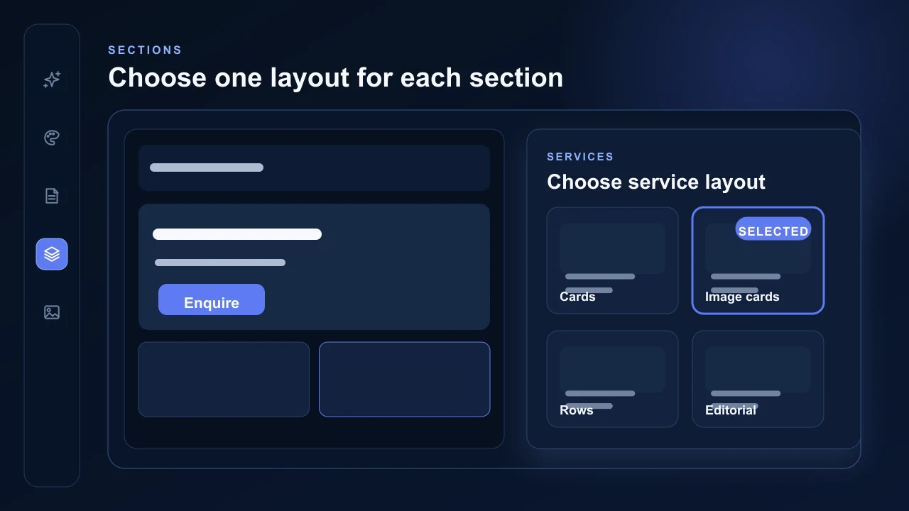
Add a section type such as Services, Gallery, FAQ, Content or Contact, then choose its layout and enter its content. Reordering or removing the section updates the page draft.
AVSBL publishes only the selected layout for each section. Unused layout choices remain in the builder catalogue; they are not shipped as hidden content inside the live page. This keeps unnecessary markup and layout assets out of the published website and helps AVSBL produce leaner, faster pages.
Phone layouts are automatic
Select Phone in the desktop builder to inspect the responsive website. AVSBL automatically adapts the selected pages, sections, content, navigation and design to the phone layout. There is no separate mobile website to build, assign or keep in sync.
The mobile web builder provides the same main editing areas, so the website can be edited from a phone browser. Desktop is recommended for longer building sessions because the larger canvas makes it easier to switch between Desktop and Phone, keep editing panels open and compare both views. The same mobile builder is intended for AVSBL app access when the packaged apps are released.